Complexity for the Sake of Simplicity :
A look into the Coastline Paradox and Its Implications in the World of Data Analysis
In the realm of data analysis, the seemingly counterintuitive notion that complexity can lead to simplicity often manifests in surprising ways. This intricate relationship is beautifully exemplified by the coastline paradox, a concept that challenges our perceptions of measurement and scale, ultimately leading us to a deeper, more nuanced understanding of data. This article delves into the paradox, its implications, and a practical example demonstrating how embracing complexity can, paradoxically, simplify our understanding of the world.
The Birth of the Coastline Paradox
In the early 20th century, Lewis Fry Richardson, while researching the potential link between border lengths and the likelihood of war, encountered a puzzling discrepancy. The Portuguese reported their border with Spain to be 987 km, while the Spanish asserted it was 1214 km. This observation marked the birth of the coastline paradox, a revelation illustrating how varying methods and scales of measurement could lead to varying interpretations of a seemingly simple concept - the length of a border.
But what actually is the Coastline Paradox?
Consider measuring a large circle's circumference using equal straight-line segments of length ℓ. One method would be to lay the first rod so its ends were both touching the perimeter of the circle, then lay the second rod so one end it touching the end of the first rod, and you repeat until you get around the entire circle. Now image the rods were half the length, the perimeter would appear to be slightly longer.:
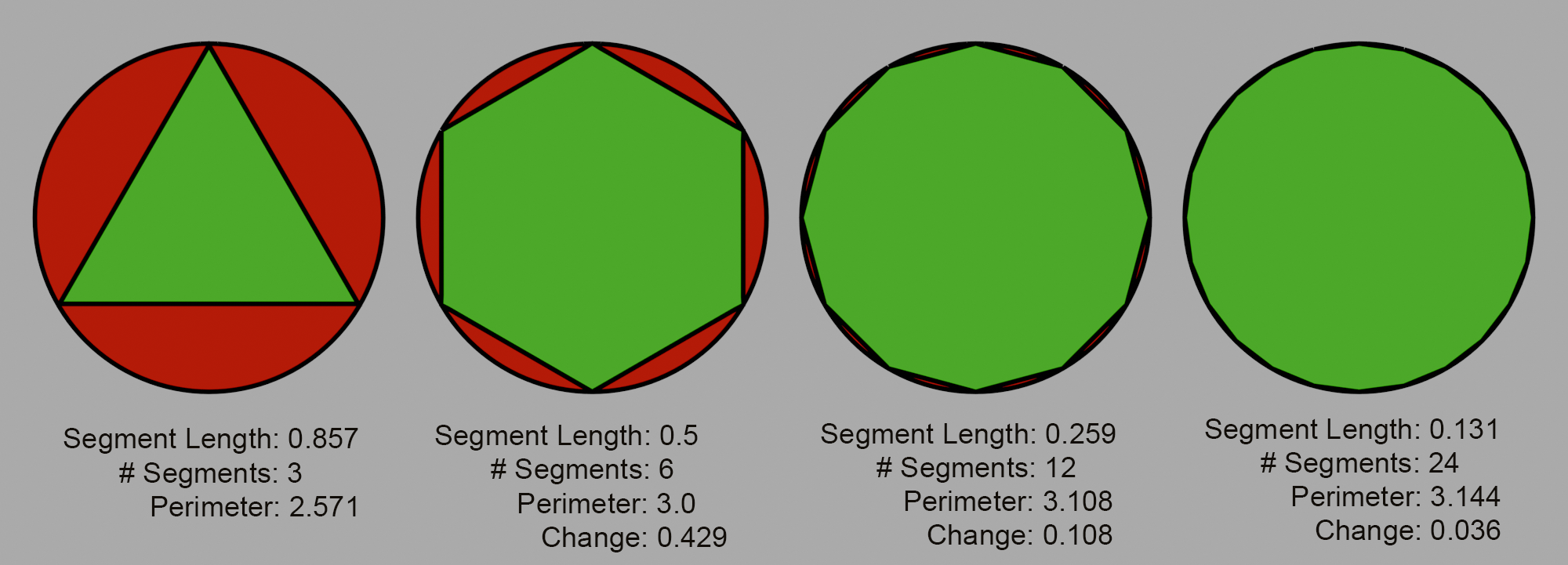
So you repeat, measuring the perimeter, then halving the lengths of the rods by progressively halving the length of these segments and remeasuring, the perceived perimeter increases, with each increase diminishing in size and converging to the circle's true circumference.
The conventional method of measuring the perimeter of a country is exactly the same - you lay out n equal straight-line segments of length ℓ along the perimeter - however, this results in a strikingly different outcome. As the segment length decreases, the total measured length continuously grows, diverging instead of converging to a single definitive value. This phenomenon, known as the "Richardson effect," indicates that the shorter the straight line segments used, the lengthier the measured border. Essentially, the Spanish and Portuguese geographers weren't wrong; they were just using different-sized segments;
Addressing the Paradox: Two Approaches
We explore two distinct solutions to this paradox, and the implication of each on an example: one simple, straightforward, and intuitive; the other a complex, unintuitive, abstraction taken from the realm of fractal dimensions.
The simple solution
A seemingly logical resolution would be to standardize the segment length for measuring country perimeters. The Spain/Portugal border discrepancy arose from using different segment lengths for measuring, if we all agree to use the same segment length to measure the perimeter of countries we should all get the same answer. Just to reiterate, this standardization won't ever yield a "true" perimeter, as our earlier discussion clarifies its non-existence. It does, however, give us the ability to compare perimeters across multiple countries, we'll be able to say which country has the longest perimeter and by how much. However when we attempt to perform a ranking - in this case comparing countries by total perimeter vs segment length - something unexpected arises:
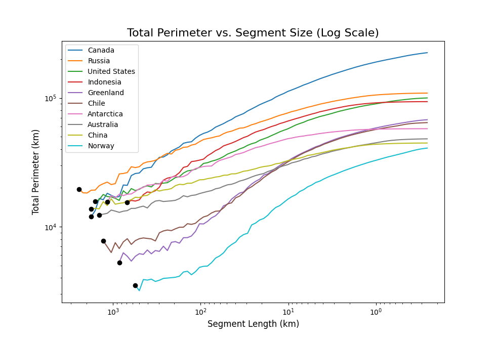
We see the ranking changes as we change the segment length, we showed previously that a country's perimeter tends to infinity as we shrink the segment size, but here we are showing that the rate at which it increases varies country to country. This again is very unintuitive, but does it matter? There are plenty of grey areas in the physical world, we can just choose where to draw the line and pick a segment length to be the standard, and if people want to change the segment length to suit their use case then they can. Let's run though a quick example:
A quick example
Let's assume we want to see if there is a correlation between a countries perimeter and its happiness index (the why of this study is left as an exercise for the reader). Since there is no standard segment length for measuring countries perimeters (yet), we will test across a range, doing so gives us the following:

This looks like a lot of information but we're just focusing on the "P-value (Correlation)" Column for now. We are ideally looking for a P-value<0.01 so that we can say that there is a statistically significant correlation, unfortunately it seems like this is not the case for any of the values we tested, however we can't say for sure that there isn't a correlation overall, just that there doesn't appear to be a correlation at any of those individual scales. We only considered a standard single-variable Pearson correlation, we might be dealing with multicollinearity, we could perform Multiple Regression Analysis or Ridge Regression or Canonical Correlation Analysis or....
Suddenly, we are grappling with a much more complex multivariate problem, necessitating the consideration of the dependency between different scales, among numerous other factors and complexities such as including other variable in the regression. This simple approach, it seems, resists simplicity.
Let's see what the complicated method has to offer.
The Complicated approach
In this approach we will embrace the counterintuitive world of seemingly abstract pure mathematics, particularly that of fractals - infinitely complex geometric constructions with repetition at every scale. By considering the perimeters of countries as a fractal, we can begin to comprehend and account for the near infinite complexity of their measurement.
Unlike a persons height, or the perimeter of a circle, which is a strictly one-dimensional measurement, the perimeters of most countries do not conform to simple dimensions. They exist in a fractal space that, in this case, lies between the one-dimensional and two-dimensional realms.
What does any of that mean? For a more detailed explanation of fractal dimension than I can provide, see this video by 3B1B. For a simplified explanation, consider a line, a one-dimensional shape. To make it twice as big, we can just double its length, which is $2^1$ times its length. If we deal with a square, a two-dimensional shape, then to make it twice as big, we need four times its area ($2^2$ times its area). For a cube, a three-dimensional shape, we need eight times its volume ($2^3$ times its volume).
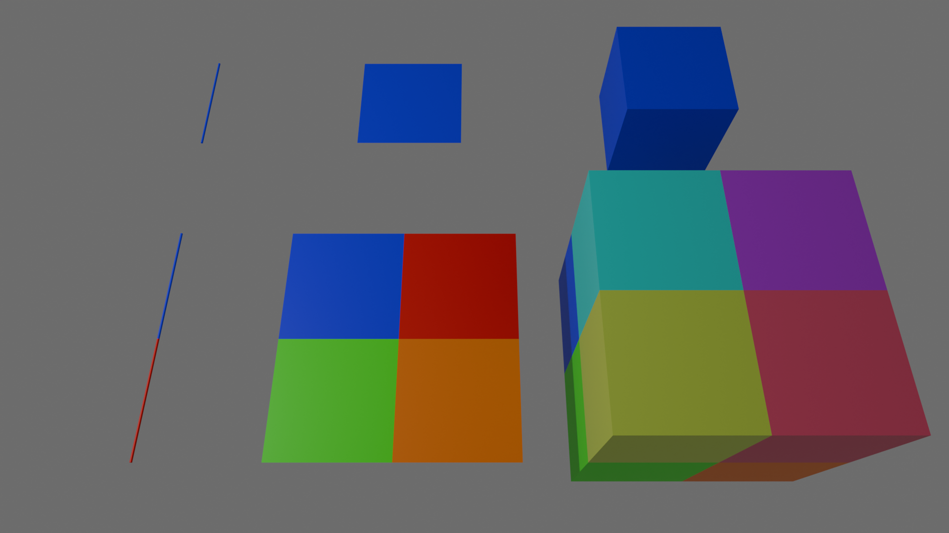
In general, the dimension of a shape is the exponent used when scaling. Though we've used 2 in this example, the same principle holds for any scaling factor: $$N=S^D,\quad N=\text{Number of self-similar pieces}$$ $$S=\text{Scaling factor},\quad D=\text{Dimension}$$ A fractal dimension is, for the most part, any dimension D that is not a whole number, for example, the perimeter of Ireland has a dimension of $D\approx1.2909$, and Hungary has a perimeter of dimension $D\approx1.0907$. This means that if we were to half the length of segments used (which is equivalent of keeping the segments the same size and doubling the size of the country we're measuring) we would expect the perimeter to grow by $2^{1.2909}\approx 2.45$ for Ireland, and $2^{1.0907}\approx 2.13$ for Hungary. This is also why the rankings change when we change the segment length, each countries perimeter exists in a different dimension meaning its perimeter grows at a different rate.
Calculating a countries Dimension:
How did we go about finding the dimension of Ireland and Hungary? We start with the equation from above: $$N=S^D,\quad N=\text{Number of self-similar pieces}$$ $$S=\text{Scaling factor},\quad D=\text{Dimension}$$ We then take the log of each side and rearrange to get the dimension: $$\log(N)=\log{S^D}=D\log S$$ $$D=\frac{\log{N}}{\log{S}}$$
This may be all well and good, but how do we find $\frac{\log{N}}{\log{S}}$? For this, we can bring back our Richardson plot for each country and calculate the line of best fit. The slope of that line is: $$\text{slope}=1-\frac{\log{N}}{\log{S}}\quad \Rightarrow \quad \frac{\log{N}}{\log{S}}=1-\text{slope}$$ allowing us to write: $$D=\frac{\log{N}}{\log{S}}=1-\text{slope}$$ For example, take the country of Ireland:
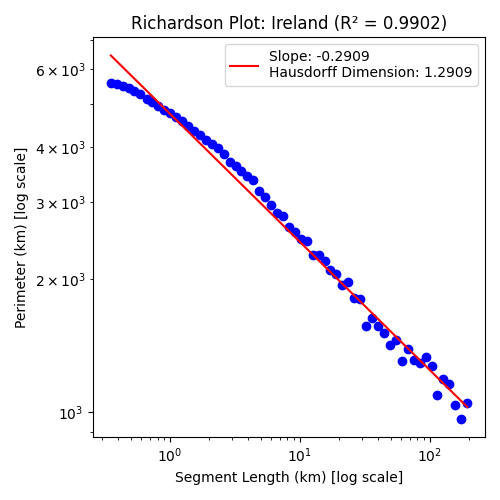
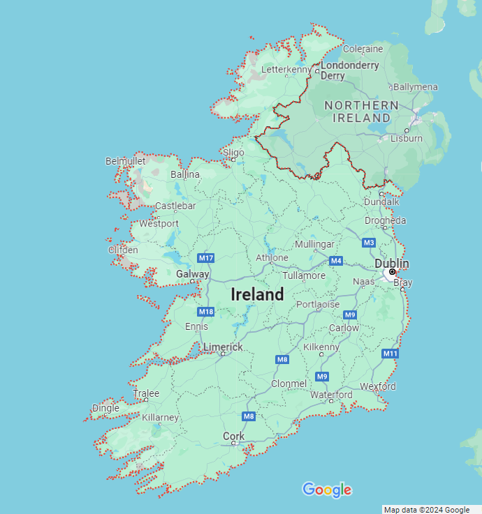
The $R^2$ term relates to how good of a representation of our data the red line is, the closer to 1 the better. As you can see this method works surprisingly well. However, it is most effective for naturally formed entities like islands, which have been shaped organically at all scales for millions of years, such as Ireland. This still applies to a surprising degree to landlocked countries whose borders have been defined by human politics and warfare on a time scale several orders of magnitude smaller than the natural formation of coastlines:
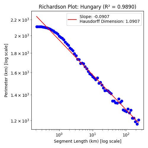
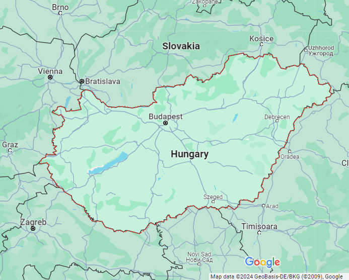
Of course these borders are still influenced by natural formations of rivers and mountains and the general topology of the land. But for the most part these countries that have had their borders shaped through centuries of large and small scale conflict, carving a patchwork of political fractal across the entire world.
For those countries defined, for the most part, by a few quick strokes of a pen on a map by a monarch in a distant land, the results aren't quite as reliable:
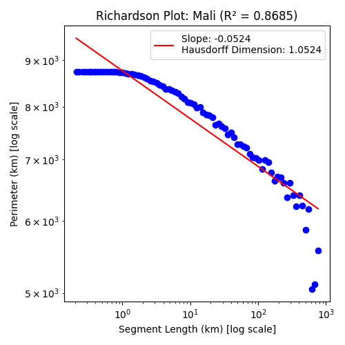
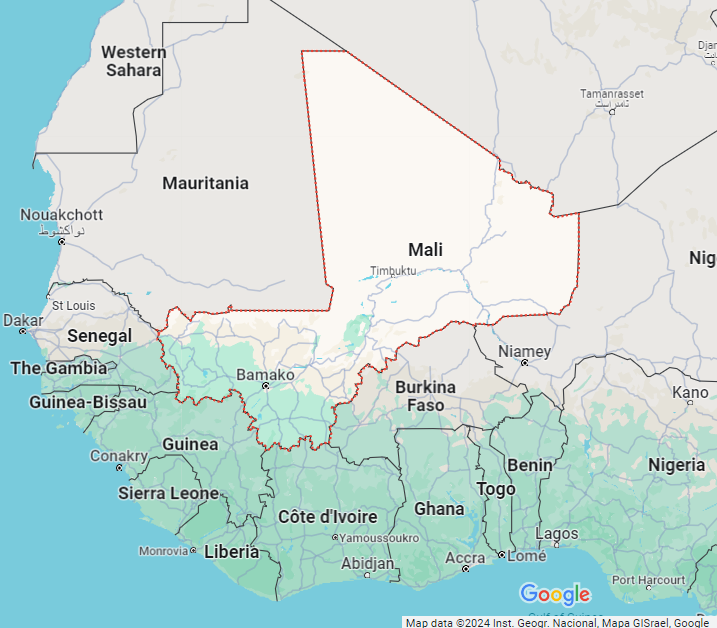
We find that for these countries things flatten off when the segment length gets past a certain size, with decreasing segment length leading to a more converging perimeter. This has the result of biasing the line of best fit, decreasing the dimension.
What we've discovered here is called the Hausdorff dimension.
Revisiting Our Hypothetical Study
By representing a country's perimeter through its fractal dimension, we achieve a consistent metric across all scales simultaneously. A single variable representing the perimeter of each country allows us to shake off worries of multivariate collinearity, and make use of the much more simple, single variable, standard persons test. A test which returns a very different result this time round.

Here we see that the P-value is ~6.7E-14 which is 0.000000000000067 - definitely less than 0.01. This means we can say there is a statistically significant correlation between the happiness index of a country and that country's perimeter's Hausdorff dimension.
To put this in perspective, here is a table showing how a handful of other variables perform - including the variables we used in the simple method.
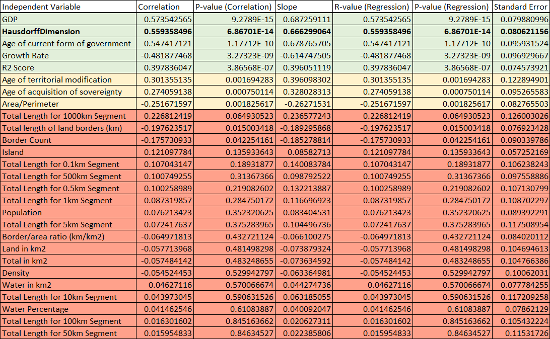
I leave it to the reader to come up with their own ideas as to why the dimension of a countries perimeter correlates so strongly.
Real world implications
The correlation between the perimeter of a country and its Happiness Index - though fascinating - has a narrow spectrum of real-world usage, but it is not hard to find other examples that would have deeper real-world implications. In Territorial disputes, countries may argue over the true length of their coastlines to assert maritime rights; in environmental conservation, understanding the true complexity of a coastline can be crucial for preserving its ecology and biodiversity. In the field of data analytics and modelling, understanding the underlying complexities of data and patterns is crucial. The paradox teaches us that simplistic approaches to measurement can lead to misleading conclusions, highlighting the need for a more nuanced understanding of the complexities involved.
Conclusion
In essence, the coastline paradox is more than a quirky mathematical oddity; it's a reminder of the complexities inherent in measuring our world, and as such underscores a fundamental truth in data analysis: embracing complexity can yield simplified, more meaningful insights. This paradoxical idea challenges us to look beyond surface-level data and delve into the intricate layers beneath.